About Us
Shenandoah University, established in 1875, is a private, nationally recognized university that blends professional career experiences with liberal education. We invite you to join our close-knit community, which is rich in creative energy and intellectual challenge.
We’re Shenandoah! Nice to meet you.
Where is Shenandoah University? What does it look like? What programs does it offer? What makes it REALLY special? Find your answers here and learn about some of the great opportunities available at this exciting and innovative small university where personal attention is the norm.
Stop by for a visit to meet us in person!
Mission & Vision
Shenandoah University educates and inspires individuals to be critical, reflective thinkers; lifelong learners; and ethical, compassionate citizens who are committed to making responsible contributions within a community, a nation and the world.
Shenandoah University will be nationally recognized for forward thinking programs that produce competitive and purposeful graduates.
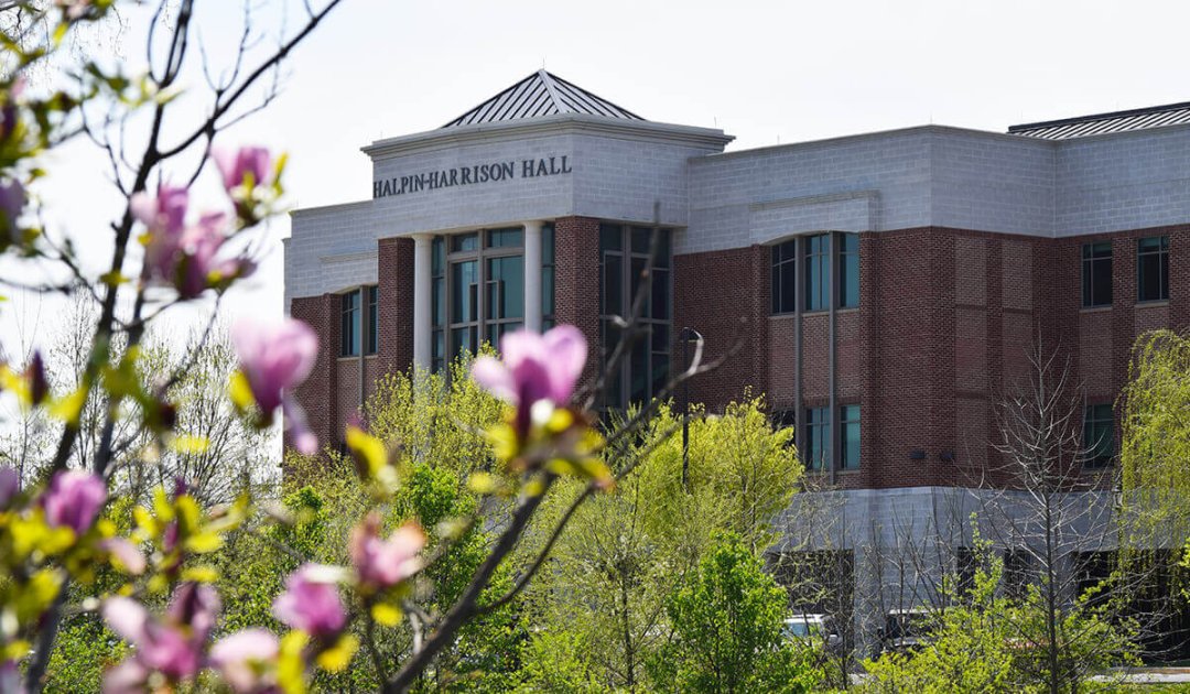
Six Schools | 1 University
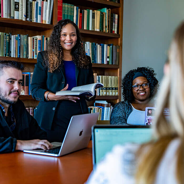
With approximately 4,000 students across more than 200 areas of study in six different schools, you will study with accomplished professors who provide you with focused, individual attention, all the while leading several programs to be highly nationally ranked. At Shenandoah, faculty will know you by name, and you will receive the encouragement and support you seek as you aspire to achieve your goals and plans for the future.
Welcome to our dynamic academic community.
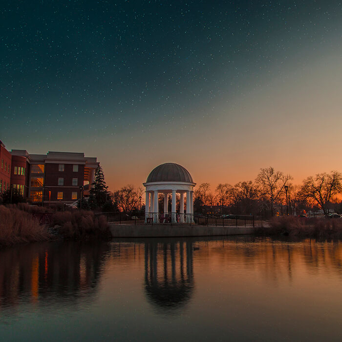
5 Diverse Locations
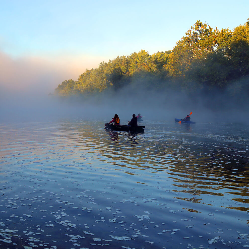
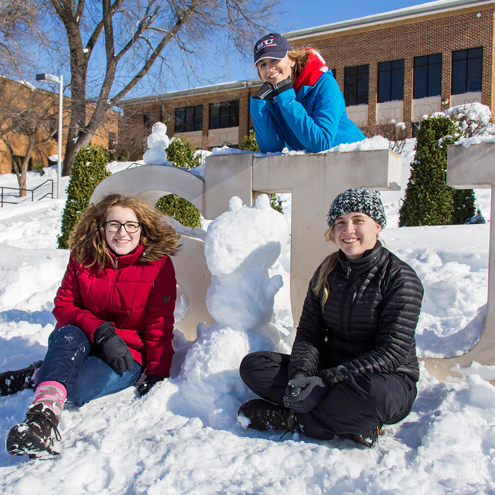
Shenandoah is a creatively charged campus where ideas and connections meet cultures and perspectives. Headquartered in Winchester, Virginia, with locations in the Northern Shenandoah Valley and Northern Virginia, Shenandoah University is in close proximity to Washington, D.C., and Baltimore, Maryland. This allows you to explore diverse metropolitan regions and take advantage of the four-season recreational opportunities of the Shenandoah Valley’s scenic beauty, including rivers, caves, rural vistas, and hiking and biking trails.
Be A Part of the Family
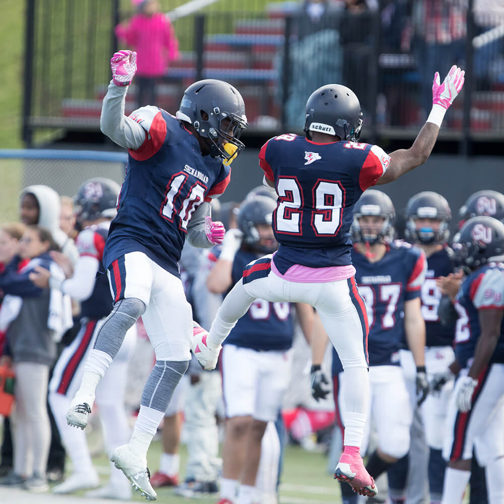
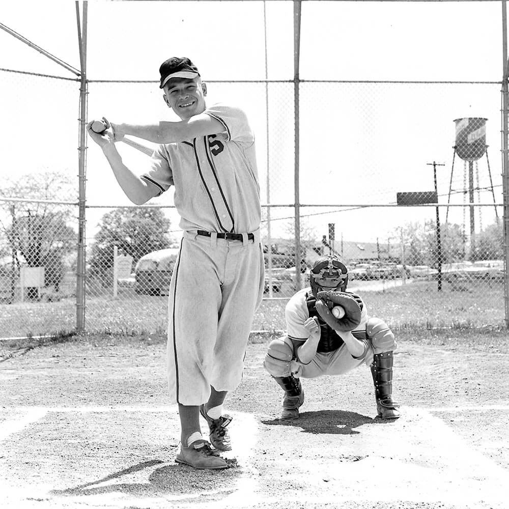
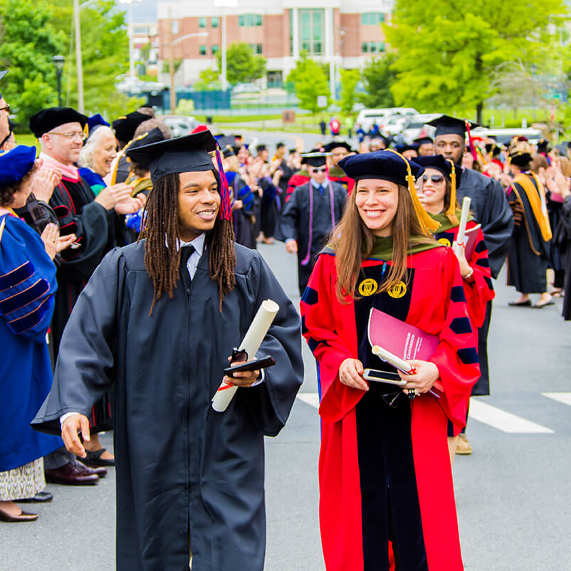
Join a campus community that brings high energy to learning and activities on and off campus. With 23 men’s and women’s athletics teams and more than 90 clubs and campus life organizations, you can get involved and jump into an active social life on campus. No matter your interests, you will enjoy plenty of opportunities to get involved and make lasting friendships through exciting on- and off-campus activities.
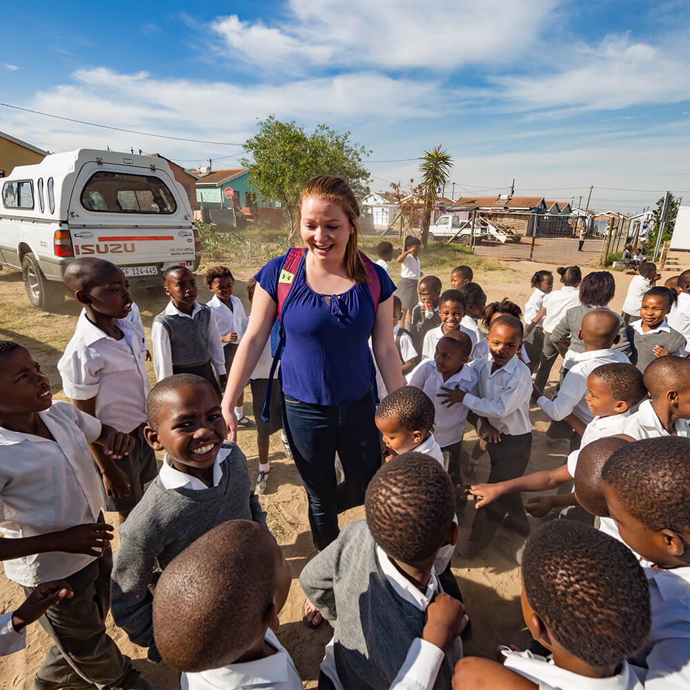
Explore the World
Mission, service, and special international programs will expose you to the world, allowing you to travel to foreign destinations, make a difference in lives, or studying abroad. You can also volunteer locally through community service initiatives.
Through innovative partnerships and programs, at both the local and global level, there are exceptional opportunities for you to learn in and out of the classroom.
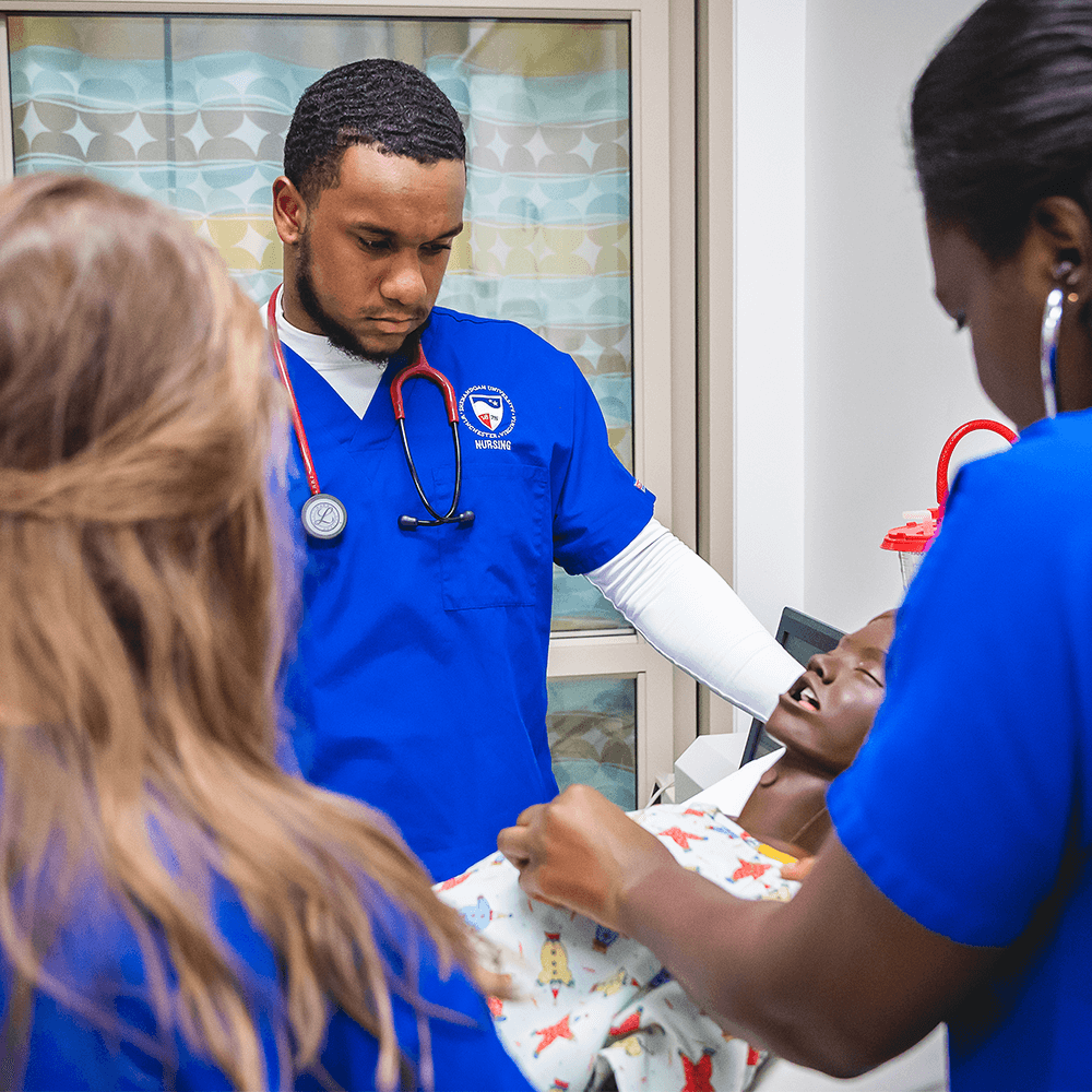
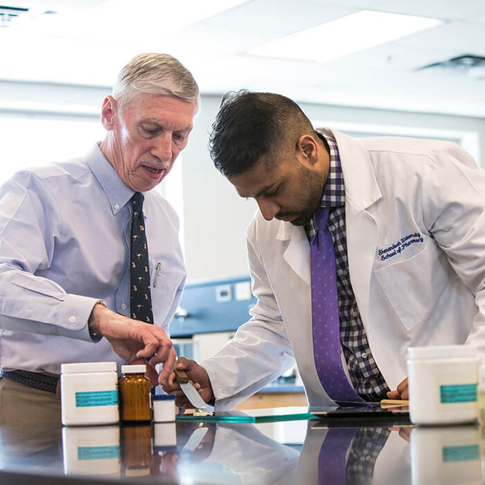
Train for Your Career
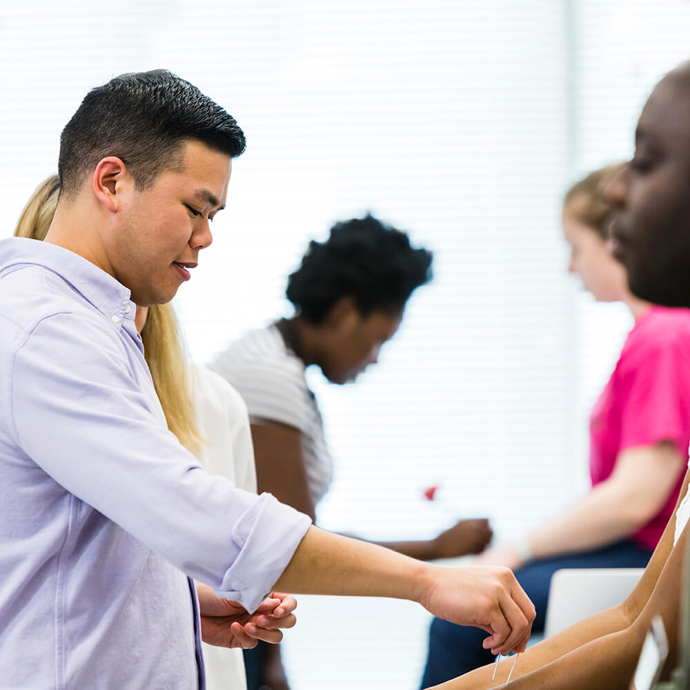
A Shenandoah University education blends the best of professional studies and the liberal arts. Whether your interest is in business, the performing arts, the humanities, natural or social sciences or the health sciences, you make a difference. As a principled professional and leader, your talents and expertise help improve the human condition wherever you go. Clinicals and internships give you exciting ways to practice what you’re learning in professional settings, allowing you to immediately make difference in the lives of others.
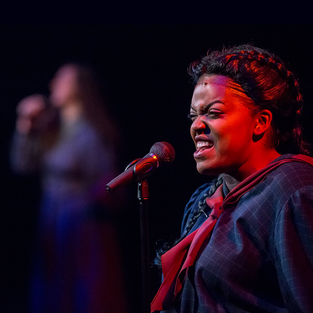
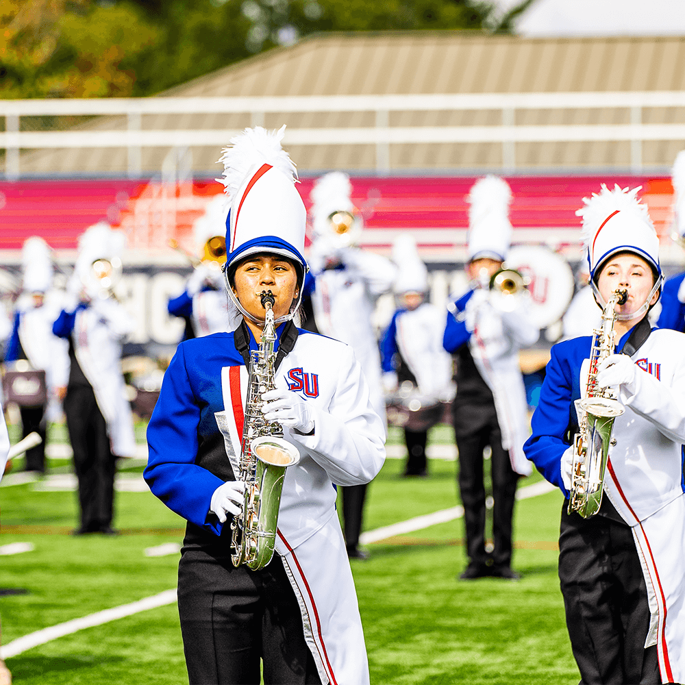
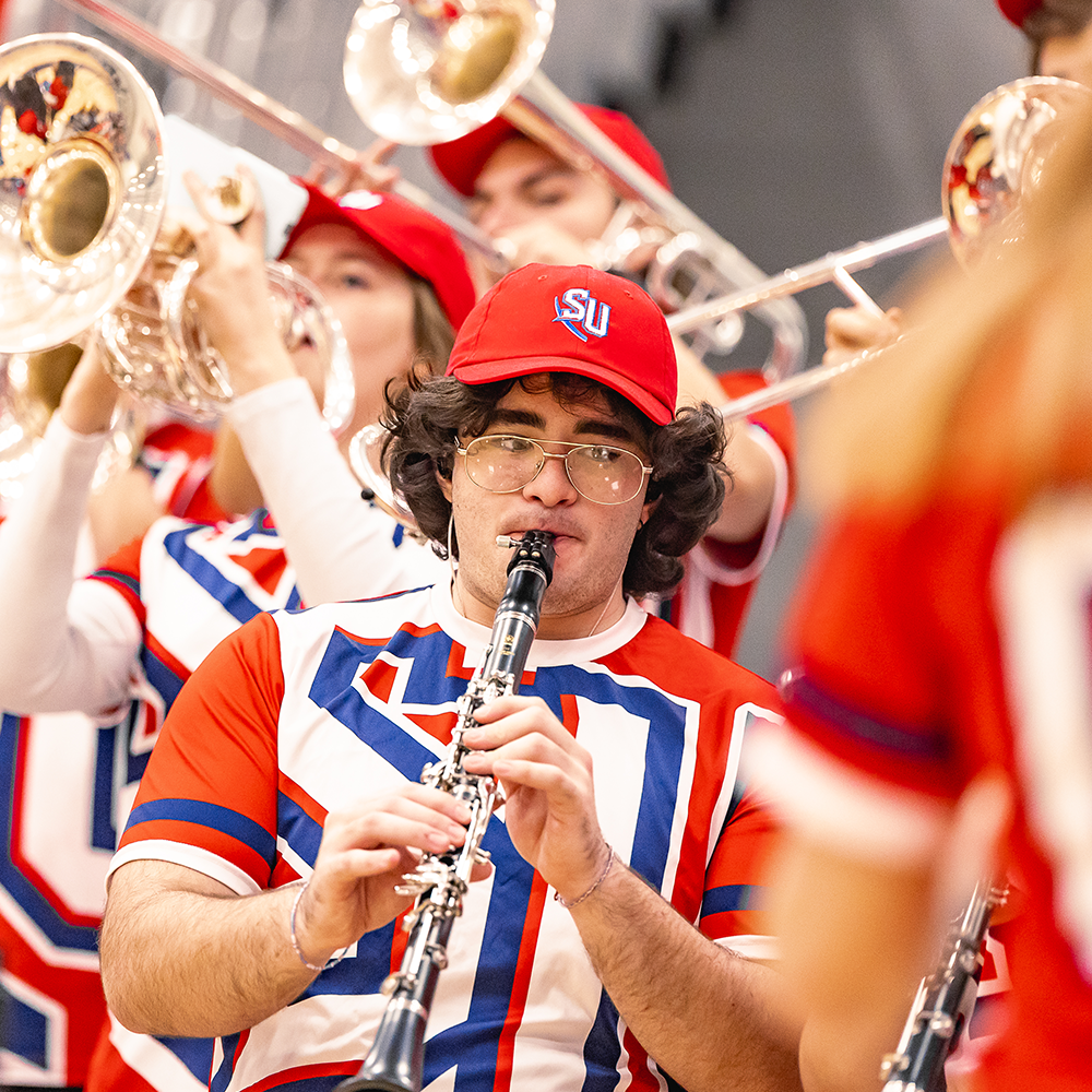
Step into the Spotlight
Immerse yourself in the spirit of sound and experience the excitement of innovative exploration. Participate in 30 music, theatre or dance ensembles through Shenandoah Conservatory or take in one of the more than 300 annual concerts or performances.
Becoming Shenandoah
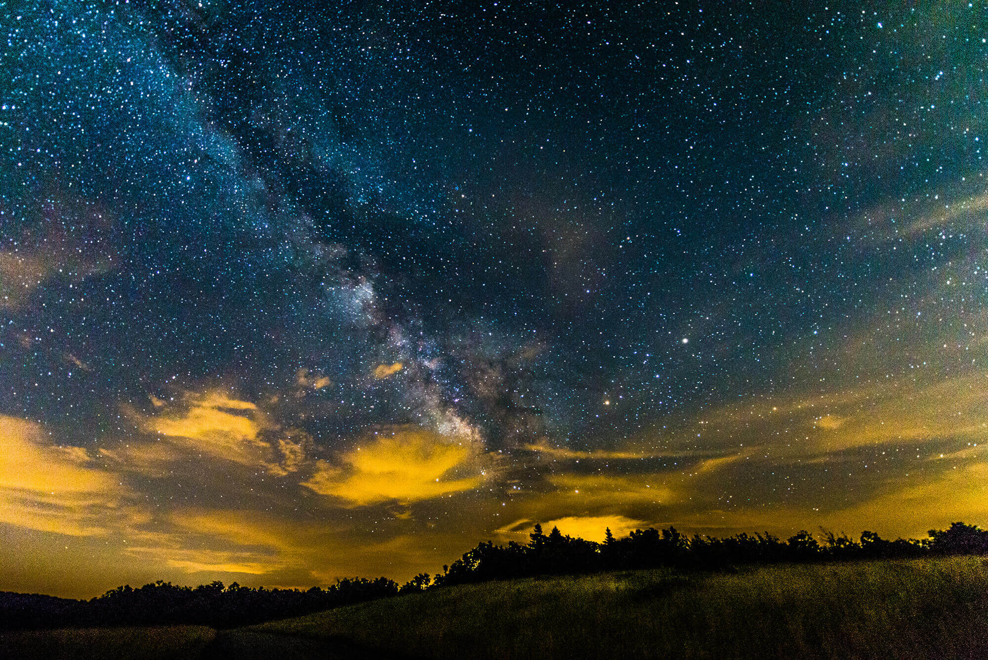
Some places radiate special qualities. Shenandoah is one, where lives are illuminated by a love of learning, collaboration, service and a deep, shared history. Its name and location evoke images of legends, natural beauty, exploration, and timelessness. Shenandoah University embraces and reflects its storied valley home, educating students as radiant and warm as mythical lights inspiring Shenandoah’s meaning: “the descendants of the stars.”
This green, fertile, and enchanting land has attracted people for thousands of years, inspiring stories, songs, and lives marked by joy, scholarship, accomplishment, and delight. That legacy remains vibrant to this day, as the leader of the future call upon the rich echoes of the past for inspiration.
We are all part of this timeless story. We are Shenandoah.
Non-Discrimination Statement
Shenandoah University values the unique and diverse perspectives of individuals and communities locally and globally and seeks to foster mutual understanding in an inviting community where individuals are welcome and respected. The university does not discriminate on the basis of race, color, religion, sex, pregnancy, sexual orientation, gender identity, national origin, age, physical or mental disability, genetic information, veteran’s status or on any other basis protected under applicable law.
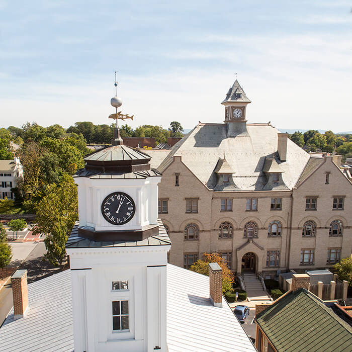
Shenandoah’s History
In 1875, the university was founded in Dayton, Virginia as Shenandoah High School. Over the next 85 years, the institution changed names six times but always kept “Shenandoah” as part of its name. Dayton was Shenandoah’s home for 85 years. Beginning in 1956, Shenandoah President Dr. Forrest Racey began the conversation with business leaders, like James Wilkins Sr., to move the school to Winchester. Shenandoah opened its doors in Winchester in September 1960. In 1991, we became Shenandoah University.
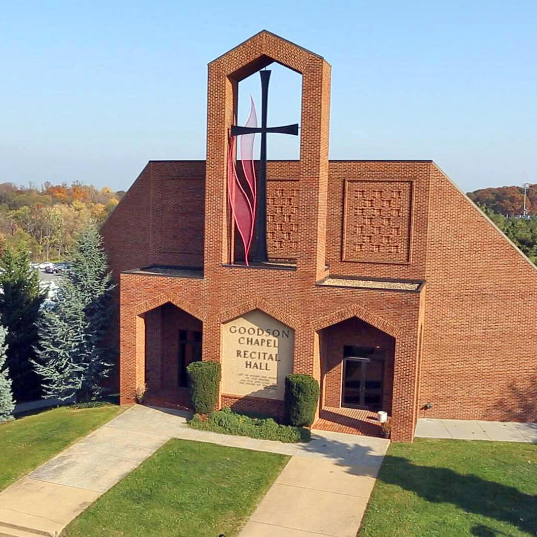
United Methodist Church Affiliation
Shenandoah University is one of six United Methodist Church-affiliated institutions of higher education in Virginia, and the spiritual life team is dedicated to calling, forming and sending leaders for tomorrow’s church and world. Shenandoah University reflects the United Methodist Church’s ecumenical spirit and global perspective by being culturally and religiously diverse.
Accreditation
Shenandoah University is accredited by the Southern Association of Colleges and Schools Commission on Colleges (SACSCOC) to award baccalaureate, master’s, and doctorate degrees. Degree-granting institutions also may offer credentials such as certificates and diplomas at approved degree levels. Questions about the accreditation of (name of member institution) may be directed in writing to the Southern Association of Colleges and Schools Commission on Colleges at 1866 Southern Lane, Decatur, GA 30033-4097, by calling (404) 679-4500, or by using information available on SACSCOC’s website (www.sacscoc.org).
Musical Traditions
Alma Mater | “Shenandoah”
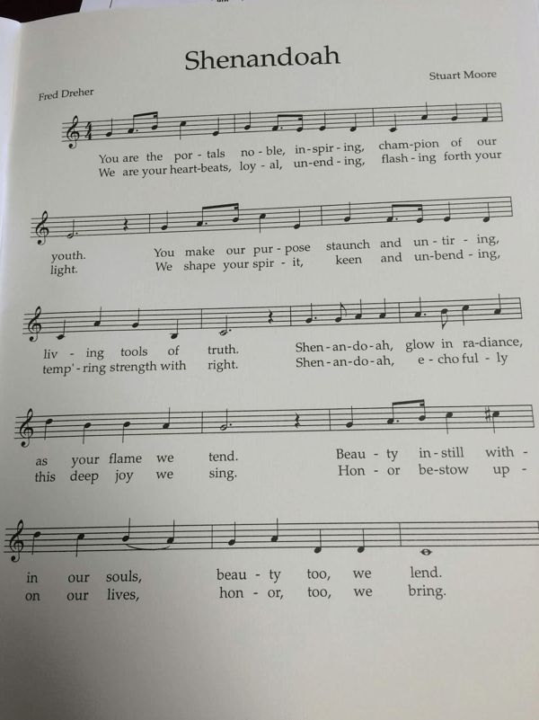
words & music by Fred Dreher and Stuart Moore
You are the portals noble, inspiring, champion of our youth.
You make our purpose staunch and untiring, living tools of truth.
Shenandoah, glow in radiance, as your flame we tend.
Beauty instill within our souls, beauty too, we lend.
We are your heartbeats, loyal, unending, flashing forth your light.
We shape your spirit, keen and unbending, temp’ring strength with right.
Shenandoah, echo fully this deep joy we sing.
Honor bestow upon our lives, honor, too, we bring.
Musical Traditions
Fight Song | “Fight For Shenandoah”
words & music by Eric Price, Class of 2009
Down in the Valley
You can hear the mighty buzz.
All our rivals fear us,
And we know this fact because,
We are Shenandoah,
And with our red and blue,
We’ll fight for alma mater
And for Hornet vic’try, too!
Privacy Policy
Shenandoah University cares about your privacy and your entire online experience while using university web products. Please review our policies and practices regarding data collection and information handling as contained in our Online Privacy Policy & Practices .
This document includes our European Union General Data Protection Regulation (EU GDPR) Privacy Notice.
Campus Closure Policy
This Campus Closure Policy applies to main campus and all Winchester satellite locations.
Unless an announcement specifically indicates otherwise, all announcements made from Winchester will be assumed to include all of the above Winchester locations.
Our Winchester Community
Whether you enjoy access to shops, unique restaurants, museums and entertainment, or national parks, you can find it in Winchester!
Learn where to stay in Winchester and explore local attractions.